
TL;DR
Open a free Amazon Business account
Business pricing, bulk buying and tax-exempt orders.
As an affiliate, we earn on qualifying purchases.
Designers use a dual palette approach, choosing light, neutral colors for daytime and darker, cozy tones for evening, based on natural light and room function. This secret enhances room ambiance and visual harmony.
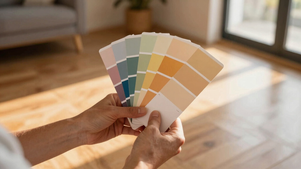
Interior designers are increasingly relying on a little-known secret to select paint colors that adapt seamlessly to natural light and room usage, creating spaces that feel dynamic throughout the day. This approach involves choosing light, neutral palettes for daytime and deeper, cocooning tones for evening, enhancing both aesthetics and functionality. The technique is gaining recognition as a way to improve room ambiance and design harmony.
According to recent insights from industry experts, the key to effective color selection lies in understanding how natural light changes from morning to evening and how different room functions influence color choices. Designers like Jessica Hobson emphasize the importance of dual palettes—light and airy shades for rooms used during the day, such as kitchens and living spaces, and darker, moodier tones for evening spaces like lounges and dining rooms. These choices are based on the natural light’s impact on color perception, with softer whites, warm neutrals, and pale blues favored for daytime use, while deep greens, olives, and rich hues are preferred for night-time environments.
Experts highlight that the orientation of a room significantly influences color perception. Sarah Fischer notes that elements like wood cabinetry can alter how a paint color appears under different lighting conditions, requiring careful selection to ensure harmony. This approach also considers decor and natural materials, which can shift color undertones, making the process more nuanced than simply picking a shade from a color wheel.
Why Dual Palettes Transform Room Atmosphere
This approach matters because it allows homeowners and designers to craft spaces that feel vibrant and welcoming during the day and cozy and intimate at night. By aligning color choices with natural light and room function, spaces become more versatile, reducing the need for constant redecorating and ensuring that each room’s mood aligns with its use. This technique enhances the overall aesthetic and emotional impact of a home, making it more adaptable to daily routines and changing lighting conditions.
paint color sample cards for natural light
As an affiliate, we earn on qualifying purchases.
As an affiliate, we earn on qualifying purchases.
Evolution of Light-Responsive Color Strategies
While the concept of using light and dark palettes is not new, recent trends emphasize its strategic application based on natural light patterns and room orientation. Industry professionals have long recognized the importance of light in color perception, but the specific practice of dual palettes tailored to daytime and evening use is gaining traction only in recent years. This shift reflects a broader movement toward personalized, functional interior design that considers the natural environment and user experience.
“You need those dark, dramatic spaces in a home that create special moments and give a big impact, as well as the light and airy spaces that seem more effortless and seamless.”
— Jessica Hobson
As an affiliate, we earn on qualifying purchases.
Uncertainties in Implementing Dual Color Strategies
While the concept of dual palettes is gaining popularity, specifics about how to best match colors to room orientation and natural light remain subjective and vary by individual space. There is limited standardized guidance on selecting exact shades for different lighting conditions, and personal preferences or existing decor can influence outcomes. Further research and practical guidelines are needed to refine these techniques for broader application.
light and dark room accent wall paint
As an affiliate, we earn on qualifying purchases.
As an affiliate, we earn on qualifying purchases.
Future Trends in Light-Adaptive Interior Color Design
Design professionals anticipate more sophisticated tools and software to help visualize dual palettes based on room orientation and natural light patterns. Additionally, ongoing education and case studies are expected to formalize best practices, making this approach more accessible to homeowners and less experienced designers. As awareness grows, dual palette strategies may become a standard in interior design, fostering more adaptable and personalized spaces.
color-changing LED lights for mood
As an affiliate, we earn on qualifying purchases.
As an affiliate, we earn on qualifying purchases.
Key Questions
How do I choose the right colors for my room based on natural light?
Consider your room’s orientation and the amount of natural light it receives. Light-facing rooms benefit from soft neutrals and whites, while darker or shaded rooms may need warmer, deeper hues to create warmth and depth. Consulting with a designer can help identify the best shades for your specific space.
Can I use the same color scheme for day and night?
While you can, the dual palette approach suggests using lighter, brighter colors during the day and darker, cozy tones in the evening to optimize mood and functionality. Mixing these strategies can create a more dynamic and adaptable environment.
Are there specific paint brands recommended for dual palettes?
No specific brands are mandated, but choosing high-quality paints with good undertone stability and lightfastness ensures consistent appearance under different lighting conditions. Many designers prefer brands like Farrow & Ball, Benjamin Moore, or Sherwin-Williams for their color range and quality.
How important is decor in enhancing these color schemes?
Decor plays a vital role in complementing and enhancing dual palettes. Natural materials, textiles, and lighting can all influence how colors appear and feel, so thoughtful decor choices are essential for achieving the desired ambiance.
Source: Homes & Gardens
NFL season / tailgating Picks
team gear
As an affiliate, we earn on qualifying purchases.