
TL;DR

Get cleaning gear delivered free with Prime
- Fast, free delivery on millions of items
- Prime Video, Amazon Music and more included
- Member-only deals all year
House Beautiful’s report gathers interior designers’ views on living room paint choices they tend to avoid, including yellow-green hues, stark grays or whites, and bright red across large areas. The designers did not identify a universally wrong color; their advice focuses on lighting, scale, personal taste and paint finish.
House Beautiful’s report asks interior designers which paint choices they would avoid in a living room, with responses pointing to yellow-green hues, stark grays or whites, and expansive areas of bright red. The designers’ answers are recommendations rather than rules: they say how a color looks depends on lighting, room use, finish and the way it is applied.
Interior designer Meghan Shadrick says green-yellow shades can become especially unappealing under evening lighting. Artificial light, she says, can push the yellow undertone further, changing how the color reads once daylight is gone. Her caution is about that particular undertone and lighting effect, not every shade of green.
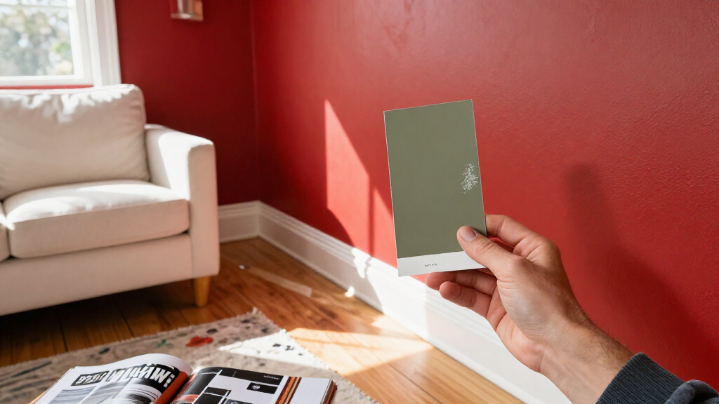
Brooke Mennen-Talsma, principal designer at Brooke MT Interiors, says cool grays can appear overly stark or flat, while some whites can also feel too bright. She favors muted, “muddy” colors for a more lived-in appearance. Shadrick also warns that bright reds may feel overwhelming across large wall areas, though she uses red as an accent or in smaller rooms.
Designer Blair Burton suggests not automatically choosing a client’s favorite color for the living room walls. A large painted surface can dominate the room and restrict other choices, she says; textiles, furniture, artwork or rugs can bring the favorite color in through several elements instead. The designers also discuss sheen: Mennen-Talsma and Burton favor lower-sheen wall finishes, which they say create a softer look and draw less attention to surface imperfections.
How Lighting and Scale Change Color
The report matters to people planning a repaint because it frames color selection as a question of how a shade behaves in a particular room, not just whether it looks appealing on a sample. Evening bulbs can alter the appearance of warm undertones, while a saturated color across every wall can have a different effect from the same color in a chair, artwork or smaller room.
Its practical takeaway is to test the intended color and finish in the actual space before committing. The designers’ comments offer a set of considerations, not a guarantee that a particular color will work or fail in every home. Natural and artificial light, furnishings, wall condition and individual preference all affect the result.
low sheen wall paint for living room
As an affiliate, we earn on qualifying purchases.
As an affiliate, we earn on qualifying purchases.
The Designers’ Advice, Not a Ban
The article’s framing asks for a color designers would “never” use, but its source material makes clear that the responses are qualified. It says there are not necessarily bad living-room paint colors; some choices are more likely to miss the atmosphere a homeowner wants. Even the colors designers warn about may work in particular settings or as accents.
Shadrick says balanced, lighter neutrals can leave room for bolder choices elsewhere. Her comments on red include exceptions for accent use and smaller, cozy rooms. Burton’s approach to a favorite color is similarly about placement: she recommends spreading it through furnishings and objects rather than making it the room’s dominant backdrop. The report does not present survey data or a shared industry standard; it records individual designers’ advice.
“In the evening, artificial light is the only light source, and light bulbs tend to turn green-yellows even more yellow and almost always go putrid in tone.”
— Meghan Shadrick, interior designer
muted neutral wall colors for living room
As an affiliate, we earn on qualifying purchases.
As an affiliate, we earn on qualifying purchases.
No Universal Color Rule
The report does not identify one color that should never be used in every living room. Its advice is based on the designers’ professional preferences and examples, not comparative testing or a poll of homeowners. It also does not specify how a particular paint will look in any reader’s room, where bulb type, daylight, wall condition and furnishings can change the effect.
The supplied report gives no publication date, and it does not assess particular paint brands, named color formulations or current product availability. Readers should treat the recommendations as prompts for testing choices, not as a definitive ranking of paint colors.
paint color samples for living room
As an affiliate, we earn on qualifying purchases.
As an affiliate, we earn on qualifying purchases.
Test Paint Before Committing
The report offers no announced follow-up or formal next milestone. For anyone considering a repaint, the practical next step is to sample a candidate color on the living-room wall and check it in both daylight and evening light. Compare finishes in the same conditions, since sheen affects how walls reflect light and can make surface flaws more visible.
Homeowners can also try a favorite or bold shade first through a rug, cushion, chair or artwork before painting a large area. Those steps do not guarantee a preferred result, but they let people judge the color in the room before making a broader commitment.
interior paint testers for living room
As an affiliate, we earn on qualifying purchases.
As an affiliate, we earn on qualifying purchases.
Key Questions
Which living room paint colors do the designers advise using carefully?
The report highlights yellow-green shades, stark cool grays or whites, and bright red across large areas. The designers describe these as choices that can be difficult in some settings, not colors that are always wrong.
Why can yellow-green paint look different at night?
Meghan Shadrick says artificial lighting can make yellow undertones more pronounced, which may change the appearance of a green-yellow wall after daylight fades.
Does the report say bright red should never be used?
No. Shadrick says large areas of red can feel overwhelming, but she uses red as an accent and in smaller, cozy rooms.
How does Blair Burton suggest using a favorite color?
Burton recommends bringing it into the room through textiles, furniture, art, rugs or pillows, rather than automatically making it the dominant wall color.
What paint finish do the designers prefer for living room walls?
Brooke Mennen-Talsma and Blair Burton favor lower-sheen wall finishes for a softer appearance. They say somewhat more sheen can be used on trim or millwork.
Source: rss
Fall Picks
fall essentials
As an affiliate, we earn on qualifying purchases.